
-(1).png)
-(1).png)

As the use of visual communication tools in scientific literature and social media increases, an international standard for their incorporation into scholarly submissions is lacking. A Pictogram Track was established at the 2021 International Distance Simulation Summit to explore this knowledge gap. Here, we will provide an overview addressing the role of pictograms in addressing the limitations of narratives in healthcare simulation reporting and enhancing simulation knowledge transmission.
Successful dissemination of healthcare simulation education methodology relies upon high-quality reporting of research that healthcare educators and the public can understand, adopt or build upon, and for which peer-reviewed standards exist [1]. During the early coronavirus 2019 pandemic, this became more relevant when simulation educators were tasked to convert simulations traditionally performed in person for education at a distance. Elkin et al.’s scoping review of healthcare distance simulation literature revealed the many challenges of understanding how simulation education or research was conducted if only a narrative was provided [2]. The uneven incorporation of imagery into simulation healthcare reporting was discussed by simulation educators and scholars at the inaugural 2020 Annual Healthcare Distance Simulation Summit (https://www.healthcaredistancesim.com/annualsummit) [3].
A dedicated ‘Pictogram Track’ was established to bring simulation educators from various backgrounds including the graphic arts, to focus on this niche area [3]. Our volunteer ensemble comprises international simulation experts and medical educators with interests in educational media and graphic design, initially formed through word of mouth amongst members of the International Pediatric Simulation Society [3]. We continue to find enduring relevance for the inclusion of pictograms in future simulation reporting and the lack of a shared understanding of standards that dictate high-quality pictograms. As there are multiple descriptors of imagery, we will provide some definitions and describe our initial findings.
An icon (examples: symbol, ‘isotype’, emojicon) is ‘a succinct, literal and visual representation of the object or thing that it represents’ [4]. From ancient hieroglyphics to ‘isotypes’ to the emojicons of the digital era, icons have been used as symbolic informational building blocks throughout history [5,6]. A century ago, the language of ‘Isotype’ (International System Of TYpographic Picture Education) was created by Otto and Marie Neurath to provide an international language of visual representations that continue to inspire the design of readily recognizable imagery still used in traffic, flight and consumer product safety today (Figure 1) [7–9]. Even then, the authors noted that work to transform written descriptions of disease transmission and statistics into illustrations must be done by ‘persons with knowledge of science, designing, colouring, printing, pasting, etc.’ [7].

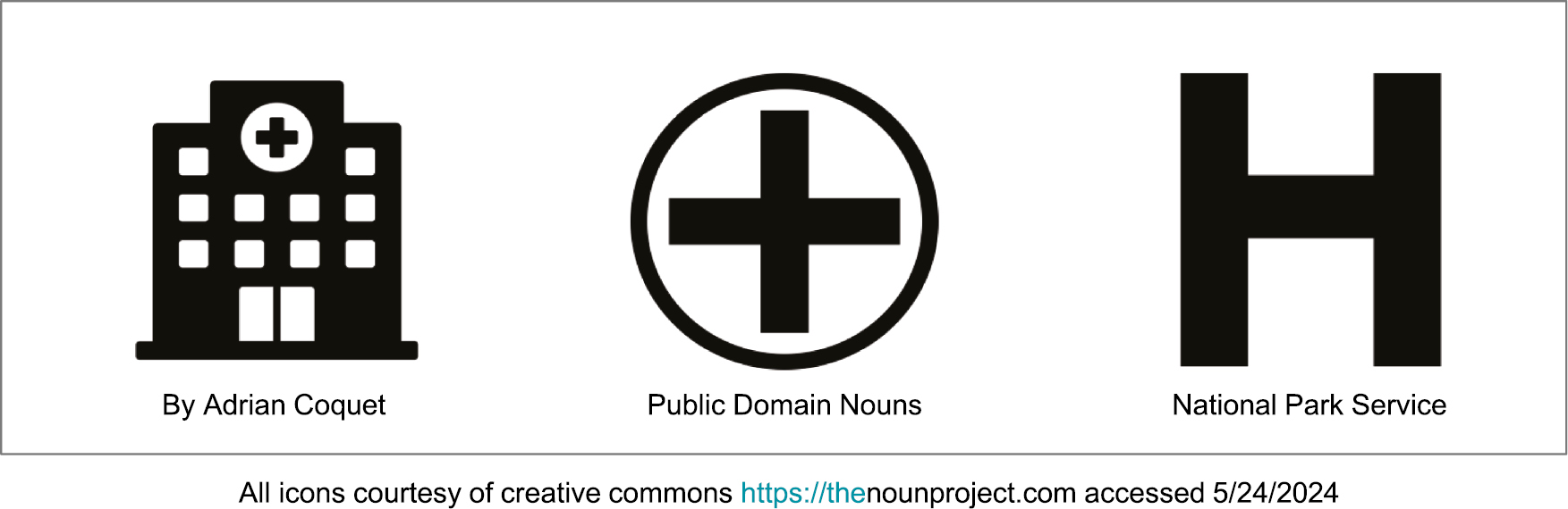
Examples of Iconic representations for the word “hospital.” All icons courtesy of creative commons https://thenounproject.com accessed 5/24/2024
Increasingly being referred to as ‘infographics’, the word pictogram, synonymous with ‘icon’ connotes an informational diagram that incorporates icons, flow diagrams or charts, photographic images, emojis and emoticons (graphic depictions of emotions). In medical reporting, pictograms provide eye-catching visual summaries of complex narratives of key research findings, with the added ability to promote readership through posting on social media sites [10,11]. As noted, the addition of a pictogram can provide much-needed clarification when describing a complex scientific procedure. Indeed, pictograms are already used to explain medical conditions, provide useful instructions for medication administration and deliver important public health notifications [12].
Pictograms are increasingly popular accessories in medical education, yet still gaining acceptance in medical reporting. There are valid concerns that the representation of research data in a pictogram may not always be sufficient for the accurate interpretation of a study [13]. While more informational resources for pictogram creation have been published since 2020, the exploration of standards for medical pictogram design, or ideals for scientific reporting is seemingly nascent [14–17]. Comprehensive work to address imagery in the arena of biomedical informatics, however, is described in Nakamura and Zeng-Treitler’s ‘Taxonomy of Representation Strategies in Iconic Communication’. This trailblazing analysis of over 800 health-related icons introduces the complexities of cultural conventions influencing graphic representations [5]. The authors describe the non-generalizability of previous studies of icon recognition because of the presence of multiple ‘lexical and semantic categories and representation strategies’. The title of the manuscript illustrates the differences in descriptive language or nomenclature in the social versus basic sciences that prohibit a shared mental model across industries. We cannot be on the same page when we lack awareness or do not share an understanding of how differently the same things can be described.
In general, the utility of a pictogram to provide visual clarification of a process or method depends both upon the quality of its visual transformation and the ability of a reader to abstract, interpret and translate it into use. For the development of globally understandable iconic representations, or, how icons look, an author and reader must share the same definition, acceptance or understanding of the same object. Even amongst anglocentric languages there can be misunderstanding of definitions; for example, a ‘medic’ in the United Kingdom is a physician, whereas in the United States of America is a paramedic [18]. Ideally, icons should be universally recognizable and culturally acceptable in multiple languages and cultures. Certainly, pioneering icons or isotypes representing populations or ethnicities in the 1930s might not be considered inclusive by today’s standards.
We propose that despite these shortfalls, pictograms offer a pragmatic solution to help convey specific details in simulation reporting more succinctly than when using written descriptions alone. While we are only addressing the study of icon representation and generalizability in reporting for simulation, the same principles could apply broadly in medical reporting and require further inquiry. Within our group, there are at least three generations of educators with some but not all adopting digital media platforms to obtain or share content. Extrapolating to the healthcare workforce as a whole, it becomes increasingly relevant to be able to describe and represent these elements precisely.
Simulation educators must already have an extensive knowledge bank regarding operational aspects of and limitations of manikins or task trainers with varying levels of technology. They must also know how to choreograph simulation in situ versus in the lab, and which activities may or may not be translated for various environments. During the early coronavirus 201919 pandemic, we experienced time constraints to locate or adapt existing educational methods for the online environment [19,20]. We identified the importance of establishing standards for the incorporation of pictograms into simulation-based education and research reporting. Telecommunication platforms were previously used to deliver team training and non-technical skills instruction for traditionally in-person education, for regions with poor access to simulation facilities, equipment or expertise [21–23]. For the foreseeable future, with both in-person and distance simulations in use, simulation educators’ skills to adapt and facilitate multiple iterations of simulations will be put to the test [24].
Elkin et al.’s scoping review described a variety of reported descriptors of distance simulation activities [2]. Distance simulation, when not all components of a simulation are in the same physical location, could be described as ‘remote’, ‘virtual’, ‘at a distance’ or ‘tele-simulation’. An in-person activity could be described as when ‘learners and instructors (facilitators) interacted with simulation equipment in a shared space at the same time’. When combined with distance simulation, known as a ‘hybrid’ simulation, descriptions of configurations required additional verbiage such as ‘participants were located in the same room of a simulation center or at a distance via audiovisual conferencing in different time zones’. Understandably, if the descriptive educational methodology was unclear, different reviewers formed unique interpretations of the same simulation [2].
We reviewed pictograms from manuscripts referenced in Elkin et al. (Appendix 1) [2]. Acknowledging that this sample may have been limited due to the nomenclature of search terms, we found the incorporation of certain visual design elements could affect how the pictogram could be interpreted. Our group discussed that adapting an in-person simulation to a distance simulation is not always straightforward, with some simulation activities being harder to reproduce than others. In this sample, although some pictograms could help to clarify certain descriptions, not all pictograms were created equally.
We discussed the qualities, purpose or focus of a pictogram that made it successful, whether useful or not. We noted that how a pictogram was assembled, and whether the visual elements were recognizable affected its usefulness. Some were very useful in providing an overview or a configuration with basic graphics or even the use of stick figures. Others used more sophisticated graphic design elements and photographs to clarify their configurations (Figure 2).
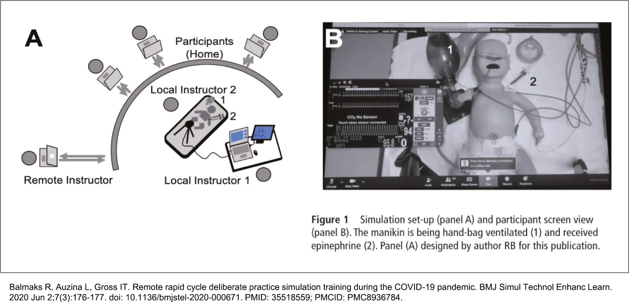
Example of a “useful” pictogram: this distance configuration features an illustration using recognizable icons, and a photograph. Reproduced with permission from: Balmaks R, Auzina L, Gross IT. Remote rapid cycle deliberate practice simulation training during the COVID-19 pandemic. BMJ Simul Technol Enhanc Learn. 2020 Jun 2;7(3):176-177. doi: 10.1136/bmjstel-2020-000671. PMID: 35518559; PMCID: PMC8936784.
Pictograms were felt to be less useful if they contained distracting elements, such as too many combinations of illustrations or icons (of similar or different styles), font styles, type sizes, colours or blurry photographic images, and especially if a long narrative was required to explain it. As a whole, the group preferred consistent elements to be used within a diagram (Figure 3). As the purpose of most pictograms was to supplement understanding or clarify written methods, we noted that some manuscripts may have included pictograms with a different purpose or meaning for an author versus reader. One telecommunication configuration was exquisitely detailed with transcontinental regalia, radio frequencies and specific electronic branding that might not be of relevance for the reader. Most pictograms focused on clarifying either the parts or a whole configuration; however, some were not intuitive as to why they were included. What initially appeared to be a useful pictogram featured icons representing male-appearing doctors and female-appearing nurses that lessened our perception of quality by reinforcing gender stereotypes.
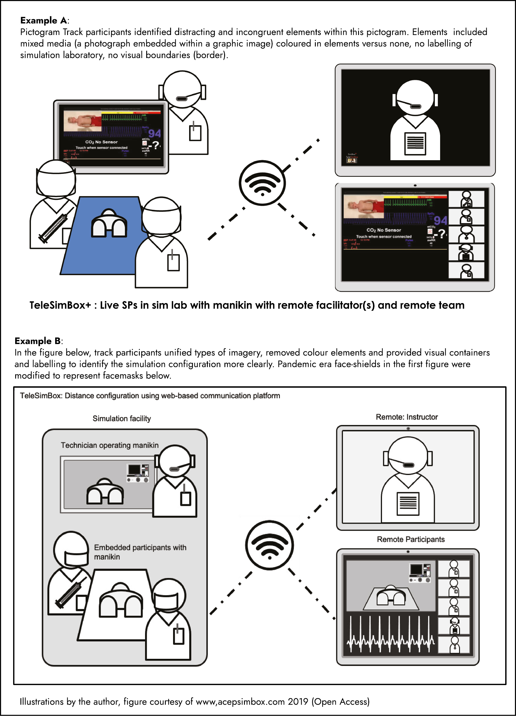
Example of how to improve upon an existing pictogram showing a distance configuration. n.b. Pandemic era face-shields in Ex. A were modified in Ex. B to represent masks. Illustrations by the author, figure courtesy of www.acepismbox.com 2019
As the availability of published simulations increases, their usefulness and ability to be reproduced also depends on how they are described. As in a theatre production, the description of a simulation configuration affects how it is staged and/or its potential to influence the fidelity or ‘realness’ for learners participating or observing the simulation event. It is easier said than done to provide a succinct verbal description of a simulation environment. Changing only a small aspect of a simulation can affect how a facilitator prepares to teach, where steps that are habitual to one facilitator may be overlooked by another if not specifically described. The ideal pictogram will address these issues.
Having outlined the more obvious limitations of current simulation reporting, we contend that the quality parameters of an ideal pictogram need to be formally established. Fortunately, a comprehensive compendium of standard simulation terms and definitions was published by the Society of Simulation in Healthcare (2015) and is regularly updated [25]. Reporting guidelines do not yet directly reference the use of visual elements; however, standardized recommendations to provide internal validity to a simulation have been developed and provide a scaffold to begin the work of how pictograms may be incorporated [1]. As a visual synopsis of textual instructions, a pictogram is more likely to be relatable if it includes icons, flowcharts or diagrams providing succinct clarification of methodology. As such, a standardized approach to the creation of pictograms could enhance the implementation of simulation exercises, with fidelity matching the author’s intentions.
We propose that a style manual or ‘picto-dictionary’ of standardized visual representations of simulation elements will be useful to clarify the global understanding of icons representing types of simulation environments and methodologies [26]. By providing a clear scaffold for simulation execution, this would ideally allow educators to spend more time with learners in person when reproducing others’ work. Anecdotally, it can take as much time for experienced educators to interpret learning events written by others as it would to develop a new case. The success of a pictogram, or balancing measure, would be reflected in the ability of educators to use their time more meaningfully and efficiently when preparing or assessing simulation events.
The ideal pictogram will provide a schematic that a simulation educator, whether novice or expert, will find intuitive and easy to interpret. Descriptions of simulation configurations could be illustrated with icons representing simulation staff and participants detailing the choreography of a simulation. Configurations could be clarified using representative icons for in-person simulation, distance simulation or the combination of both; in situ or in the laboratory; in single or multiple learner sites, with other icons portraying variances in geography, space, time or method, etc. Icons would indicate whether a simulation takes place with virtual or video augmented reality simulation, and indicate necessary features for scenarios designed for one environment that can be used in another. Here, we could also benefit from standards for design that address diversity, equity and inclusion.[26]
With increasing demand for simulation education and educators and limited resources towards developing novice simulation educators, pictograms that provide a train-the-trainer element, such as a best-practices simulation checklist will be very useful. Such schematics would incorporate clearly defined and recognizable icons representing cues for simulation steps or techniques with learner safety in mind. For example, an icon could remind a facilitator to set the scene for psychological safety during a pre-brief, provide psychological trigger warnings, the need for physical distancing and/or personal protective equipment due to contagion or which unique equipment is necessary. Recognizable hazard icons could remind facilitators to warn participants about situational awareness and physical safety when using live electricity for defibrillation, and so on. Within the pictogram, icons could also indicate where to use rapid-cycle deliberate practice drills versus running a simulation with or without pauses, and where to debrief.
Going a step further, pictograms could bear potential in assessment tool design, via the creation of iconic representations of required knowledge, skills and attitudes. The standardization of icons in health simulation reporting could provide a means to simplify educational assessments with purposeful mapping, for example, to visually stratify activities as basic or advanced. Survey fatigue and engagement could be addressed by using evaluations that incorporate iconic representations of anchor rating descriptions. When distributed via digital technology to learners’ personal devices, this could encourage more meaningful point of event feedback. The collation of results, outcomes and data analysis could then be made more efficient using artificial intelligence algorithms.
As the logical end-users of (schematic) pictograms within simulation reporting, we have begun to identify priorities for their incorporation and consensus for the minimum visual standards required for pictogram success. Working towards a Picto-dictionary, we are developing iterative processes for icon identification and pictogram creation using a human-centred design approach. The selection of representative icons might appear to be a simple task; however, thousands of icons are currently available from Creative Commons sites such as The Noun Project [27]. Nakamura and Zeng-Treitler describe the classification of icons as those with ‘visual similarity, semantic association or convention’ [5]. The addition of experts such as human factors engineers, linguists and psychologists, with knowledge of semiotics and ergonomics (and their applications to medical learning environments and learning platforms) is crucial for this process. Lastly, there are federal requirements for minimum standards for diversity, inclusion and accessibility for web-based knowledge dissemination sites. Consultation from graphic design specialists with expertise in digital media accessibility will ensure that an acceptable baseline is met.
What this essay adds:
We describe opportunities and pitfalls in the communication of the textual description of simulation designs and configurations, for which consensus on descriptors or terminology is lacking.
We discuss the role of visual communication elements (such as icons, pictograms, emoticons and diagrams) in improving understanding of simulation configurations.
We highlight that terminology regarding these elements across industries can be a barrier for shared understanding.
We suggest how the quality of simulation reporting and reproduction could be improved with standardized pictograms.
We recognize pictogram standardization will benefit from multidisciplinary experts including but not limited to simulation in healthcare, simulation operations, graphic and educational design, human factors, design engineering and semiotics.
The healthcare simulation community has an exciting opportunity to enhance the dissemination of simulation educational methods by incorporating pictograms vetted for an international audience. We invite interested members of the health and social science communities to join us in this creative endeavour.
We wish to acknowledge Drs. Aaron Calhoun, Todd Chang, Jonathan Duff, Jabeen Fayyaz, Mandy Kirkpatrick and Isabel Gross for their kind support of this project. We also thank Dr. Vic Brazil for her valuable input.
Healthcare Distance Simulation Summit Pictogram Track Attendees https://www.ipssglobal.org/healthcare-distance- simulation-summit/
2021: Michelle Aebersold, Mindi Anderson, Eric B. Bauman, Cheryl Camacho, Timothy Clapper, Salam Daher, Sarah Foohey, Khang Hee Gan, Suzie Kardong-Edgren, Florian Kreuzer, James Leung, Jack Pottle, Jamie Robertson, Elizabeth Sanseau, Anita Thomas, Patrick von Hauff
2022: Salam Daher, Becky Damazo, Khang Hee Gan, Shelita Kimble, Xiao Rong, Michele Spotts, Anita Thomas
2023: Kristen Brown, Salam Daher, Bryan Dang, Jabeen Fayyaz, Maribel Gray, Suzie Kardong-Edgren, Elizabeth Sanseau, Michele Spotts, Anita Thomas.
Conception and design: MK, JCP. Drafting of the article; MK, ES, PvH, SKE, GR, JCP. Critical revision of the article for important intellectual content: JCP, MA. Revisions and final approval of the article: ES, MK.
This is unfunded research.
References are provided.
This commentary did not require IRB approval.
All authors consent to the publication of this manuscript.
None of the authors declare any competing interests.
1.
2.
3.
4.
5.
6.
7.
8.
9.
10.
11.
12.
13.
14.
15.
16.
17.
18.
19.
20.
21.
22.
23.
24.
25.
26.
27.
 Enhancing simulation-based healthcare education and research reporting using pictograms: does a picture paint a thousand words? Commentary from the International Distance Simulation Summit Pictogram Track
 Facebook
 Twitter
 Linkedin
 Whatsapp
